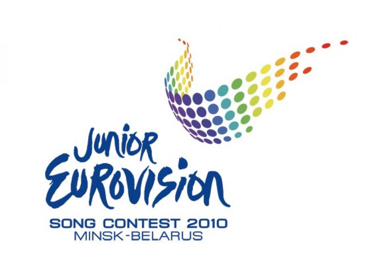
Exclusive: Presenting logo of Junior 2010
09 April 2010 at 13:06 CESTAt the meeting, the logo of the 2010 Junior Eurovision Song Contest was introduced. The idea behind it is inspiration.
"The Junior Eurovision Song Contest is an example of young talents from different countries. For these shining stars everything is possible, they can inspire millions of people all over the world! Wings are a symbol of freedom, ease of flying, creative inspiration and rising above. Different colours mean different people, cultures and countries." the organisers from the Belarusian broadcaster BTRC say.
The Steering Group's Chairman, Steve de Coninck-de Boeck, said the arena of the 2010 contest is impressive, being the largest venue ever used for the event.
"Now the main thing is to solve technical problems. For example, earlier we haven't held contest on ice platforms. That’s why we have to decide, what are we going to do – to melt the ice or to cover it," he said. Another question is where the stage will be constructed. Maybe directly in the centre of the Arena?
Svante Stockselius, the Executive Supervisor from the EBU, expressed his happiness about the current organisation. "We have a possibility to experiment. It is great. But the main thing is to do everything in the right way. When I was here in February I asked BTRC to prepare a detailed plan, up to an arrangement of the dressing-rooms. Now the plan has been shown to me and I'm pleased".
The 2010 Junior Eurovision Song Contest will be held in November this year. The winner of the 2009 contest was Ralf Mackenbach from the Netherlands with his song Click Clack.